I had an idea to look at what topics are trending on Google each day pr county in Norway. For this task I used Python to call some (unsupported) Google APIs and created the viz in Tableau.
I wanted to get the breakout topics for each day pr county and store the results in a table. To see what is trending, Google allows parameters for start and end dates, comparing this with the same offset interval.
Let’s look at an example:
https://trends.google.com/trends/explore?date=2020-07-01%202020-07-08&geo=NO-03
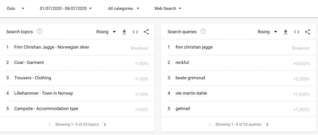
Here Google compares the data from 1st of July – 8th of July with the same interval for search topics from 23rd of June to 30th of June. One week seemed like a good interval for reducing noise and at the same time have somewhat up to date trends for the data set.
Now to get the data I had to look into which APIs the web client is accessing. There is first a call to the explore API, which then gives the token and query for the relatedsearches API. In addition since the APIs are unsupported, Google has implemented a maxlimit for access, so patience is key when running some 12 000+ API calls to get the data.
In the end I had every json file pr region pr day stored locally, and it was simply the matter of parsing the data and putting it into a Pandas dataframe.
Visualization was the easier part, I joined in vector data of counties for each topic and also had to create standalone labels since Tableau’s labels tend to be all over the place. Finally by putting the date on page shelf in Tableau, the viz will basically run itself when pressing play.
Hope you enjoy the viz, reach out to me in the comment field for any questions!
Here is the video since it probably runs a bit quicker on my laptop compared to Tableau Public, below that the actual Tableau report:

No responses yet